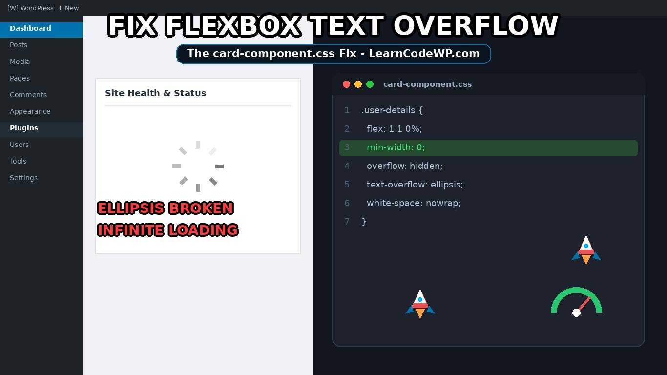

If you need to fix flexbox text overflow ellipsis clipping issues in your layout, you have run into one of the most frustrating quirks in CSS specifications. You drop text-overflow: ellipsis on a nested span, set white-space: nowrap, clamp the container with Flexbox, and watch in disbelief as your container blows out its parent width anyway. The text refuses to truncate. It spills across the viewport, generates an accidental horizontal scrollbar, and shatters your component integrity.
This is not a browser rendering bug. It is strictly documented CSS spec behavior. Let’s break down why this happens under the hood and inspect the exact lines of code needed to fix flexbox text overflow ellipsis properly across every modern browser engine.
The Root Cause: Why Flex Items Refuse to Truncate
By default, block-level containers carry min-width: 0. They can shrink down to zero pixels if their layout context forces them to. Flexbox and CSS Grid changed this default completely.
Under the CSS Flexible Box Layout Module Level 1 specification, every direct flex item receives an initial value of min-width: auto (for horizontal flex rows) instead of min-width: 0. Here is what actually happens under the hood: min-width: auto evaluates to the item’s automatic minimum size. In human terms, the flex child computes its minimum footprint based on the content sitting inside it.
When you tell an inner text element not to wrap:
broken-behavior.css.badge-label {
  white-space: nowrap;
  overflow: hidden;
  text-overflow: ellipsis;
}
The browser calculates that the text string requires, for example, 480px of continuous horizontal room. Because the parent flex item is set to min-width: auto, it informs the flex container: “My absolute floor is 480px. You cannot compress me smaller than my content.” The flex shrink algorithm halts. The ellipsis calculation never triggers because the item never calculates a constrained box smaller than its content.
How to Fix Flexbox Text Overflow Ellipsis with min-width
The solution requires explicit intervention on the flex child. You must reset the automatic minimum size constraint down to zero. Don’t just copy-paste this blindly—check your server config first if you bundle legacy CSS resets that try to override box models globally.
Here is the canonical HTML pattern: a flex card with an avatar icon on the left, an expanding middle content column, and an action button pinned to the right.
card-component.html<div class="user-card">
  <div class="avatar">IMG</div>
  <div class="user-details">
    <h4 class="user-name">Alexander Montgomery-Vanderbilt the Third</h4>
    <p class="user-email">alexander.verylongdomainnamethatexceedsviewport@subdomain.enterprise.internal</p>
  </div>
  <button class="action-btn">View</button>
</div>
Now review the companion stylesheet to successfully fix flexbox text overflow ellipsis without breaking the sibling elements:
card-component.css.user-card {
  display: flex;
  align-items: center;
  gap: 16px;
  width: 100%;
  max-width: 420px;
  padding: 12px;
  border: 1px solid #e2e8f0;
  border-radius: 8px;
  background: #ffffff;
}

.avatar {
  flex-shrink: 0;
  width: 44px;
  height: 44px;
  border-radius: 50%;
  background-color: #cbd5e1;
}

/* The critical fix starts here */
.user-details {
  flex: 1 1 0%;
  min-width: 0; /* Overrides the default min-width: auto */
}

.user-name,
.user-email {
  margin: 0;
  white-space: nowrap;
  overflow: hidden;
  text-overflow: ellipsis;
  display: block;
  width: 100%;
}

.action-btn {
  flex-shrink: 0;
  padding: 8px 14px;
}
Step-by-Step Breakdown to Fix Flexbox Text Overflow Ellipsis
Let’s examine why these specific declarations resolve the overflow:
Line 21 introduces flex: 1 1 0% on .user-details. This tells the item to grow into leftover space, permits it to shrink below its initial content footprint, and seeds its base size at 0%.
Line 22 applies min-width: 0. This is the lynchpin. By discarding auto, you explicitly tell the browser layout engine that this flex child can shrink narrower than the intrinsic length of the text string it encloses.
Lines 27-29 establish the classic text-truncation triad: white-space: nowrap prevents soft wrapping into multiple lines; overflow: hidden clips the overflow boundary; and text-overflow: ellipsis appends the three dots at the clip seam.
A mistake I see developers make all the time: applying overflow: hidden directly to the parent flex container and skipping min-width: 0 on the child. That simply masks the layout overflow without triggering the actual typographic ellipsis on the text node.
Nested Flex Items: Handling Multiple Nesting Depths
Here is the catch: if your truncated label sits three layers deep within nested flex containers, setting min-width: 0 on the immediate parent is not enough. The size constraints cascade down the tree.
Every intermediate ancestor flex item between the outer constrained wrapper and the text element must declare min-width: 0 (or overflow: hidden). If even one intermediate flex child in the hierarchy retains the browser default min-width: auto, it enforces its intrinsic width upward and re-breaks your layout.
CSS Grid vs Flexbox Truncation Behavior
CSS Grid exhibits this exact same behavioral characteristic. In Grid layouts, columns compute with an implicit minimum of auto unless overridden.
| Layout System | Default Minimum Track / Child Size | Required Truncation Reset | Common Failure Point |
|---|---|---|---|
| Flexbox Row | min-width: auto | min-width: 0 | Unconstrained child blows out wrapper |
| Flexbox Column | min-height: auto | min-height: 0 | Vertical multi-line clamp failure |
| CSS Grid | grid-template-columns: minmax(auto, 1fr) | minmax(0, 1fr) | Grid track blows outside viewport width |
Notice the Grid equivalent in the table above. When dealing with Grid columns, switching your track from 1fr to minmax(0, 1fr) performs the exact same mechanical role as applying min-width: 0 on a flex child.
Troubleshooting and Gotchas
Still running into issues? Verify these three common edge cases before debugging further:
1. Inline Elements Don’t Obey Width Bounds: text-overflow: ellipsis does nothing on native inline elements like <span> or <a> unless you set them to display: block or display: inline-block.
2. Sibling Squeeze via flex-shrink: Ensure unyielding elements beside your text column (like avatars or icons) explicitly have flex-shrink: 0. Without this, your long text string might crush your icons into zero-width slivers before truncating.
3. Tooltips and Absolute Containers: If you attach absolute tooltips or badging wrappers inside a flex item utilizing overflow: hidden, the tooltips will get clipped at the container border. Separate your truncation wrapper from your interactive tooltip wrapper.
Frequently Asked Questions
Does setting min-width: 0 cause performance regressions?
No. min-width: 0 simply bypasses the intrinsic content measurement stage during flex layout calculation. In large DOM trees with heavy data tables, setting fixed min-widths can actually marginally reduce reflow calculation overhead.
Can I use multi-line line clamping with this technique?
Yes. You can swap white-space: nowrap with modern line clamp syntax (display: -webkit-box; -webkit-line-clamp: 2; -webkit-box-orient: vertical;). However, you still need min-width: 0 on the flex child to ensure the parent bounds are respected during width calculations.
Why doesn’t overflow: hidden on the parent fix flexbox text overflow ellipsis alone?
Because overflow: hidden on the outer container merely masks the visual bleed. It stops the page from displaying horizontal scrollbars, but it cuts off the entire inner DOM node abruptly instead of calculating character positions to insert the ellipsis dots.