
css text overflow ellipsis not working flex is one of the most frustrating frontend bugs you will encounter when building modern WordPress themes or custom layouts. You apply white-space: nowrap, set overflow: hidden, and slap a trusty text-overflow: ellipsis on your title. Yet, instead of truncating cleanly with three dots, your long text stubbornly refuses to shrink, blowing out the parent container and shattering your flexbox alignment entirely. Here is what catches developers off guard: flex items have an initial min-width: auto property by default. According to the official MDN Web Docs, this forces flex containers to calculate sizing based on intrinsic content width rather than allowing standard truncation.
Why Text Overflow Ellipsis Fails Inside Flexbox
A mistake I see developers make all the time in production is assuming that traditional block-level text truncation rules apply identically inside a display flex environment. When you build complex web components—such as post lists, comment rows, or e-commerce card titles—you often rely on flexbox for alignment. However, flex containers behave uniquely under the hood. By design, flex items refuse to shrink below their minimum content size. If your child element contains a long string without natural breaking spaces, the browser forces the element to expand infinitely, ignoring your truncation properties completely.
Before tackling layout bugs, make sure your core asset styling is solid, much like understanding html input file attributes when handling form components. Let us examine a broken layout scenario where the ellipsis completely fails to render:
style.css.flex-container {
  display: flex;
  width: 300px;
}

.flex-item {
  white-space: nowrap;
  overflow: hidden;
  text-overflow: ellipsis;
  /* Missing min-width: 0 causes blowout */
}
How to Fix Overflow CSS in Flexbox Layouts
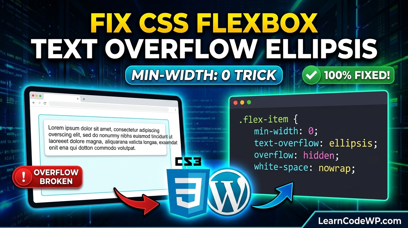
Here is the exact fix. To force your flex items to respect truncation boundaries, you must explicitly override the default minimum sizing behavior. Setting min-width: 0 on the flex child allows the element to shrink below its intrinsic content size. For advanced layout debugging techniques, review our guide on fix-css-text-overflow-ellipsis-not-working to ensure your typography renders reliably across all screen sizes.
Don’t just copy-paste this blindly—check your parent container’s width constraints and padding first. Here is the corrected production-ready CSS snippet:
style.css.flex-container {
  display: flex;
  width: 100%;
  max-width: 400px;
}

.flex-item {
  flex: 1;
  min-width: 0; /* Crucial fix for flex truncation */
  white-space: nowrap;
  overflow: hidden;
  text-overflow: ellipsis;
}

.flex-icon {
  flex-shrink: 0;
}
Line-by-Line Code Breakdown
Let’s break down why this specific combination of rules solves the issue:
1. display: flex establishes the modern flexible container context.
2. flex: 1 instructs the item to grow and fill available horizontal space evenly.
3. min-width: 0 overrides the browser default min-width: auto, granting the item permission to shrink past its content width.
4. white-space: nowrap prevents wrapping words onto new lines.
5. overflow: hidden clips any overflowing character streams.
6. text-overflow: ellipsis appends the trailing dots to indicate clipped content.
Comparing Truncation Approaches Across Layout Engines
Different layout engines require distinct considerations when managing overflowing text. Review the comparison table below to determine the correct property adjustments for your specific project architecture.
| Layout Engine | Default Min-Width / Min-Height | Required Fix for Ellipsis |
|---|---|---|
| Block Layout | Auto / 100% | max-width or explicit width |
| Flexbox | auto (Intrinsic content) | min-width: 0 or flex-basis: 0 |
| CSS Grid | auto (Min-max auto sizing) | min-width: 0 or use grid minmax() |
Troubleshooting & Gotchas
If your ellipsis still fails after implementing min-width: 0, check for these common pitfalls:
– Nested Flex Containers: If your text element sits inside multiple nested flex wrappers, you must apply min-width: 0 to every parent flex item along the chain.
– Image or Icon Children: Ensure adjacent icons or avatars have flex-shrink: 0 applied, otherwise flexbox might crush your icons instead of truncating your text.
– Inline Elements: text-overflow requires block or inline-block formatting contexts. Make sure your target element isn’t an unstyled inline span without display declarations.
Frequently Asked Questions
Why does text overflow ellipsis require min-width: 0 in flexbox?
By specification, flex items have a default minimum size equal to their content. Setting min-width: 0 allows the browser to shrink the item below its content width, making text clipping and ellipsis rendering possible.
Does this same issue happen in CSS Grid layouts?
Yes. CSS Grid items also have a default minimum size of auto. If you place text inside a grid cell and want to truncate it, you must apply min-width: 0 or utilize explicit track sizing with the minmax() function.
Can I use width: 100% instead of min-width: 0?
No. Setting width: 100% inside a flex container often causes the item to overflow its parent because flex item sizing calculations factor in margins and flex-basis differently than standard block layouts.